
Branding and theming
One prebuilt image runs as any community’s site. Nothing about your identity is compiled in — it is a theme row in the database, three image files on a mount, and a few environment variables for the values that must exist before the database does.
Appearance
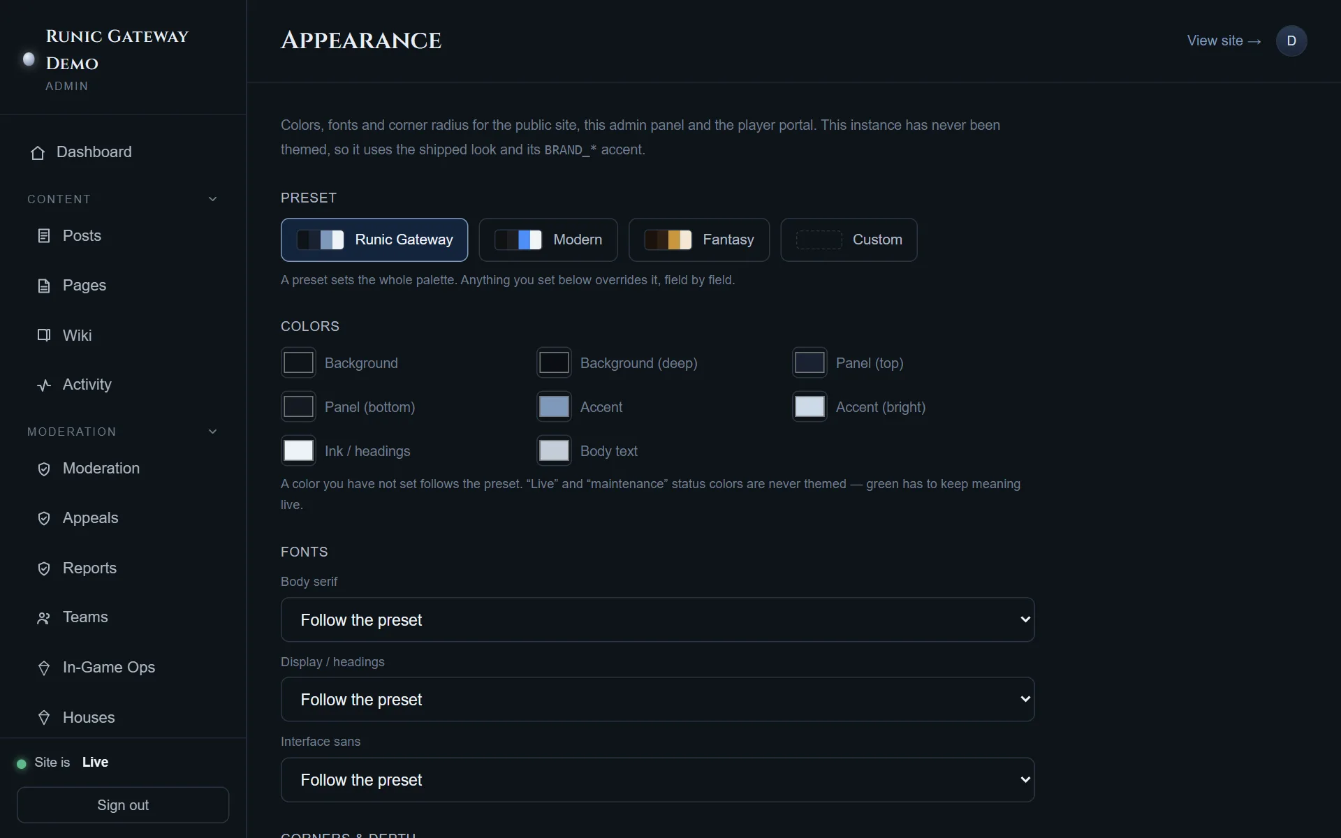
Section titled “Appearance”Admin → Appearance themes the public site, the admin panel and the player portal together.
Presets — Runic Gateway, Modern, Fantasy, Custom — set a whole palette at once. Anything you set below a preset overrides it field by field, and a colour you never set keeps following the preset. That is the useful property: pick the preset closest to what you want, change the two colours that are wrong, and the rest still moves with it.
| Group | What is in it |
|---|---|
| Colors | Background, deep background, panel top and bottom, accent, bright accent, ink/headings, body text |
| Fonts | Body serif, display/headings, interface sans — each with a “follow the preset” default |
| Corners & depth | Radius for pills and buttons, flat panels, cards, inputs; and card shadow |
Two things the screen tells you that are easy to miss:
- Live and maintenance status colours are never themed. Green has to keep meaning live.
- The accent reaches the mobile app and the Discord bot, both of which theme themselves from this site’s public branding. Changing it here changes them.
Brand assets
Section titled “Brand assets”The same screen uploads three images, and each applies as soon as the upload finishes — there is nothing to save.
| Asset | Where it shows | Limit |
|---|---|---|
| Logo | Site header, admin sidebar, player portal, and link previews when a page is shared | 1 MB |
| Hero image | Behind the portal hero, unless the hero editor has its own background | 8 MB |
| Favicon | The browser tab. PNG only; 32×32 or 64×64 works everywhere | 512 KB |
Underneath, these are files on the ./brand bind mount from
Install the site, pointed at by BRAND_LOGO,
BRAND_HERO and BRAND_FAVICON. An upload writes there; so does copying a file in by
hand. Both are supported, and the mount is why replacing a logo never means rebuilding an
image.
The text that comes from the environment
Section titled “The text that comes from the environment”A few identity values are read before the database is available — the server templates them
into index.html at boot so that link previews and the tab title are right on the very
first request:
BRAND_NAME, BRAND_SHORT_NAME, BRAND_TAGLINE, BRAND_DESCRIPTION,
BRAND_ACCENT_COLOR, BRAND_URL, BRAND_CONTACT_EMAIL.
Where an admin-editable setting exists for the same thing — site title, contact email — the setting wins. The variable is the value a fresh deployment starts from.
The portal hero
Section titled “The portal hero”Admin → Hero Editor composes the front page’s hero directly: drag elements to place them, drag the corner handle to resize (text scales with the box), Delete removes the selected one. The palette adds text, buttons, the moon, a badge or an image.
Its own background image and overlay darkness are set at the bottom of the editor, and a background set here wins over the Appearance screen’s hero image.
Work is not live until you press Publish; Preview opens it in a new tab, and Revert to live throws away an unpublished draft. Until anything is published at all, the portal renders the shipped hero with the homepage teaser from Settings underneath it.